
If you rely on it, we’ll take care of it
Asurion Tech Care is a self-branded D2C ecosystem created to expand beyond its predecessor, Home+.
I was part of this ambitious initiative to reimagine the Home+ offering, with the goal of revitalizing stagnant growth and reducing customer confusion and mistrust surrounding unlimited product coverage.
Disclaimer: I have omitted or obfuscated confidential information in this case study. All content reflects my own perspective and does not necessarily represent the views of Asurion.
THE CHALLENGE
“Unlimited” isn’t always alluring
Asurion built its business through mobility partnerships, providing coverage for mobile devices like phones and tablets. As the company looked to expand beyond mobility, it saw an opportunity to cover other frequently used (and frequently broken) tech products—such as video game consoles and everyday home electronics. Enter Home+.
Home+ was the company’s first flagship direct-to-consumer (D2C) product, offering unlimited device coverage. For a flat monthly fee, customers could protect nearly every electronic device in their home. Initial take rates were promising. However, by early 2025, sales plateaued, and multiple go-to-market experiments aimed at improving attach rates failed to drive sustainable growth.
So, what was the problem?
User research revealed that “unlimited” coverage wasn’t as compelling as expected. Customers were skeptical of a plan that seemed to cover virtually everything. Rather than feeling empowered, many felt a lack of control and clarity. They wanted a plan they could tailor—one that allowed them to choose which devices were covered and feel ownership over their protection.
The core challenge became clear: reimagine the Home+ value proposition to shift from a one-size-fits-all “unlimited” model to a customer-controlled, customizable experience. Asurion’s role wasn’t to dictate coverage—it was to enable customers to protect their tech in a way that felt simple, transparent, and fully in their control.
My role: Sr. UX Designer
I owned: Research, Enrollment, Billing & Payments, Account Management
Build Measure Learn, Information Architecture, Iterating, Product Market Fit, Product Strategy, Product Vision, Prototyping, Testing, Usability Testing, User Research, Visual Design, Wireframing
Tools: Figma, Fullstory, Claude, ChatGPT, v0, Cursor
Duration: 9 months
Official in-store launch: June 2025
MY ROLE
I was handpicked by the VP of Design to transition from the Enrollment Team to a newly formed team leading this initiative. Our group consisted of me, a Principal Designer, another Senior Designer, and the Director of Design, who oversaw the entire Asurion.com web experience. Together, we formed the foundation of the initiative codenamed “Joyful Home.”
Additionally, we worked closely with product managers, a content strategist, researchers, and developers to bring the experience to life.
KICKOFF
“Hi <Customer>, it’s Asurion”
I had been at Asurion for three years when this project began. Before that, I worked on much smaller teams—including as the sole UX designer at a startup called Split Lease, backed by just a couple of angel investors and largely funded by its founder.
Now, I was one of about 30 designers at a multi-billion-dollar company. In the shift to scale, some of the scrappy, research-driven practices I valued at my previous jobs—like consistent user testing—were often deprioritized in favor of speed. But without research, it’s easy to make assumptions about customers instead of understanding them.
Before evolving Home+, we needed to reconnect with users. The product had proven initial product-market fit, but that was only enough to launch, not to sustain growth.
I partnered with a senior researcher, Val, to run an early round of user testing while I was still on the Enrollment Team—before “Joyful Home” existed. At the time, the idea was to reposition Home+ toward gamers to increase attach rates. We were skeptical that changing the audience would solve the deeper issue, and the research confirmed it.
Users were frustrated with the “unlimited” model. Although it covered nearly every device in the home, it excluded smartphones—the device people cared about most. Many questioned the value: if they couldn’t cover their phone, why pay to protect cheaper devices? Others said they didn’t want unlimited coverage at all—they wanted to choose a few key devices and pay less.
The insight was simple: customers didn’t want unlimited. They wanted control—and coverage for their phones.
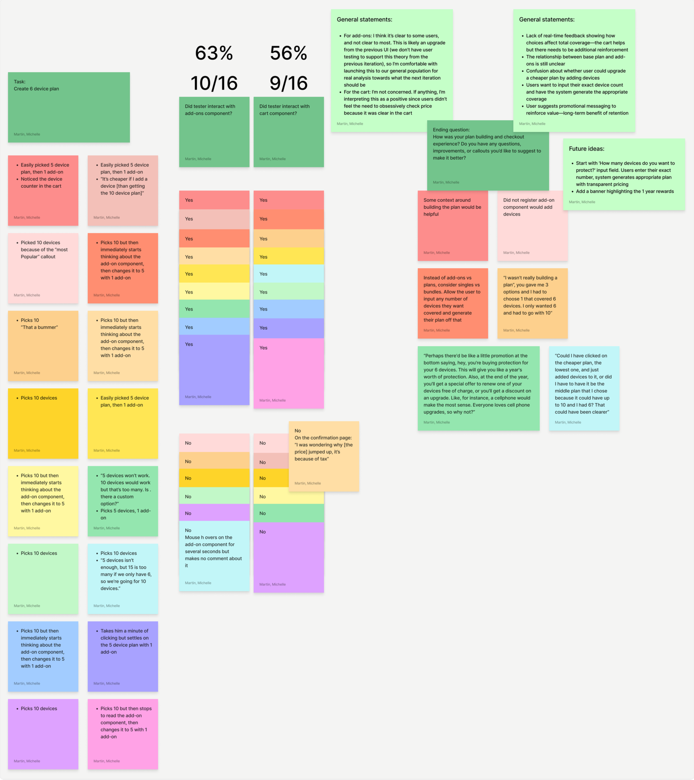
Cart usage was split (56% interaction), showing no strong behavioral advantage.
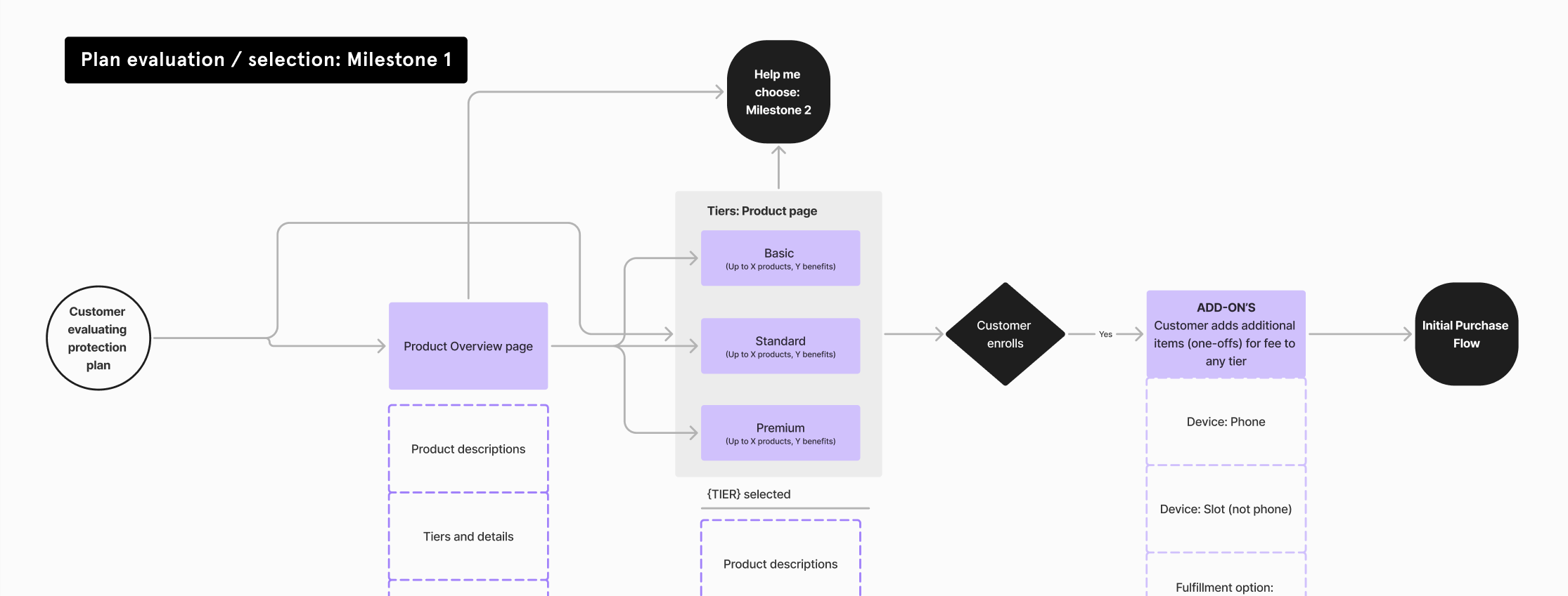
USER FLOWS & VALIDATION
Add to cart or straight to checkout?
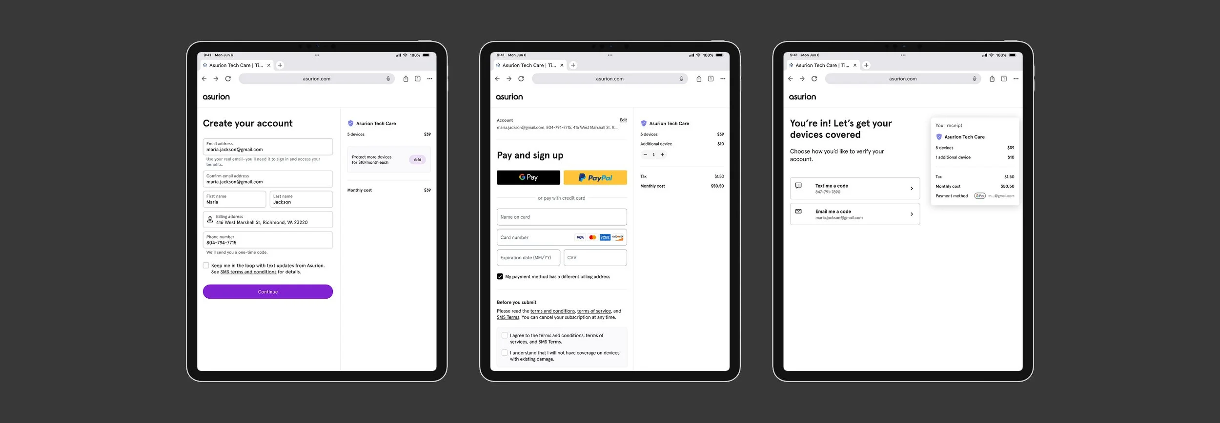
After an additional month of research, Joyful Home received approval to move forward. I contributed to the initial acquisition and enrollment flow mapping and led testing initiatives focused on making enrollment as simple and frictionless as possible.
A key internal debate centered on whether to include a cart to preserve user progress. Some stakeholders viewed it as a necessary remarketing tool for users who didn’t complete enrollment. Through competitive analysis of subscription services offering customized plans, I found that most streamlined the process by eliminating the cart entirely.
To resolve the debate, I designed and conducted MVP-level user testing to evaluate the enrollment flow with and without a cart. My goal was to ensure we launched a focused, scalable solution without overengineering the initial release. Test results indicated that including a cart neither improved nor hindered users’ progression (as illustrated by the rainbow card sort results). This validation gave us confidence to move forward without adding unnecessary complexity.
Launched with backend-only progress saving.
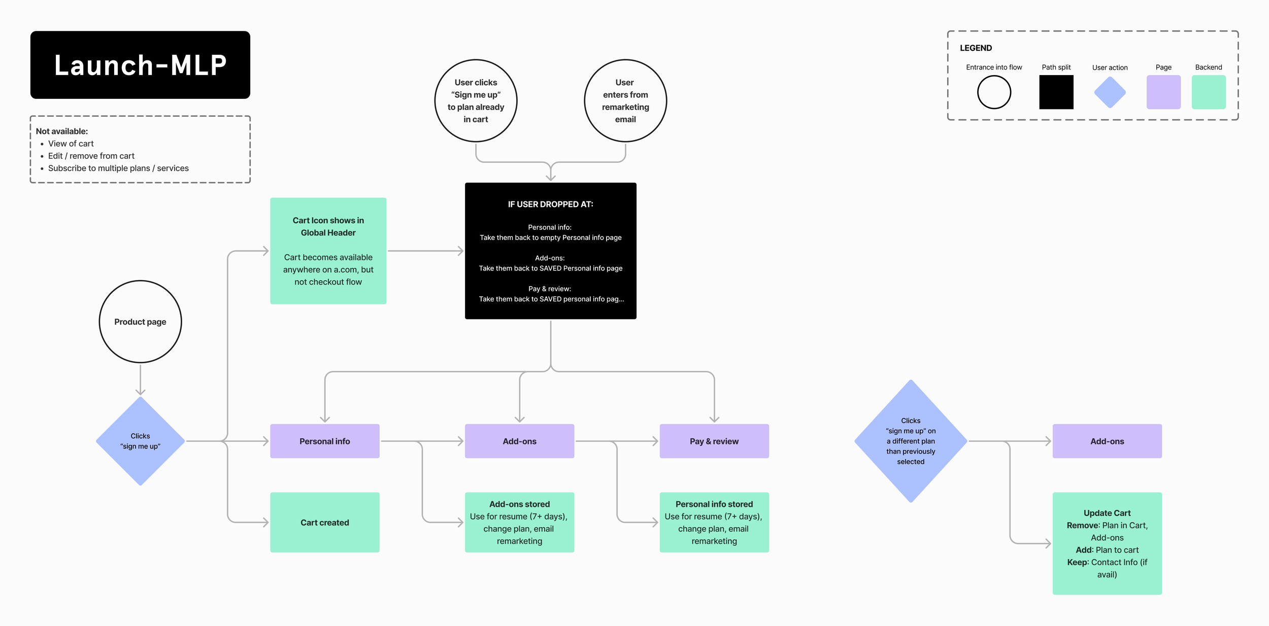
In-store iPad experience for enrollments at launch.
ITERATIONS
Insights from launch
The initial pilot launched in a small group of corporate uBreakiFix stores. Within the first week, the product outperformed Home+ in sales rate. By the end of the first month, it continued exceeding benchmarks, validating demand and supporting expansion into additional states.
Key takeaway: The concept was validated quickly in a live retail environment, with several new opportunities identified.
1. Payment Friction Slowed Checkout
Issue: No tap-to-pay. Customers had to manually enter full card and billing details.
Impact: Slower checkout, customer frustration, added rep burden.
Opportunity: Enable tap-to-pay, reduce manual fields, streamline billing flow.
2. Enrollment UI Wasn’t Optimized Enough for Tablets
Issue: Small touch targets and font sizes.
Impact: Input errors and slower completion times, increased need for rep assistance.
Opportunity: Increase touch targets, improve legibility, design tablet-first.
3. Multi-Device Attach Was Strong — With Room to Grow
Observation: Customers were adding additional devices at a solid rate.
Opportunity: Refine messaging and simplify device add-ons to increase attach rate further.
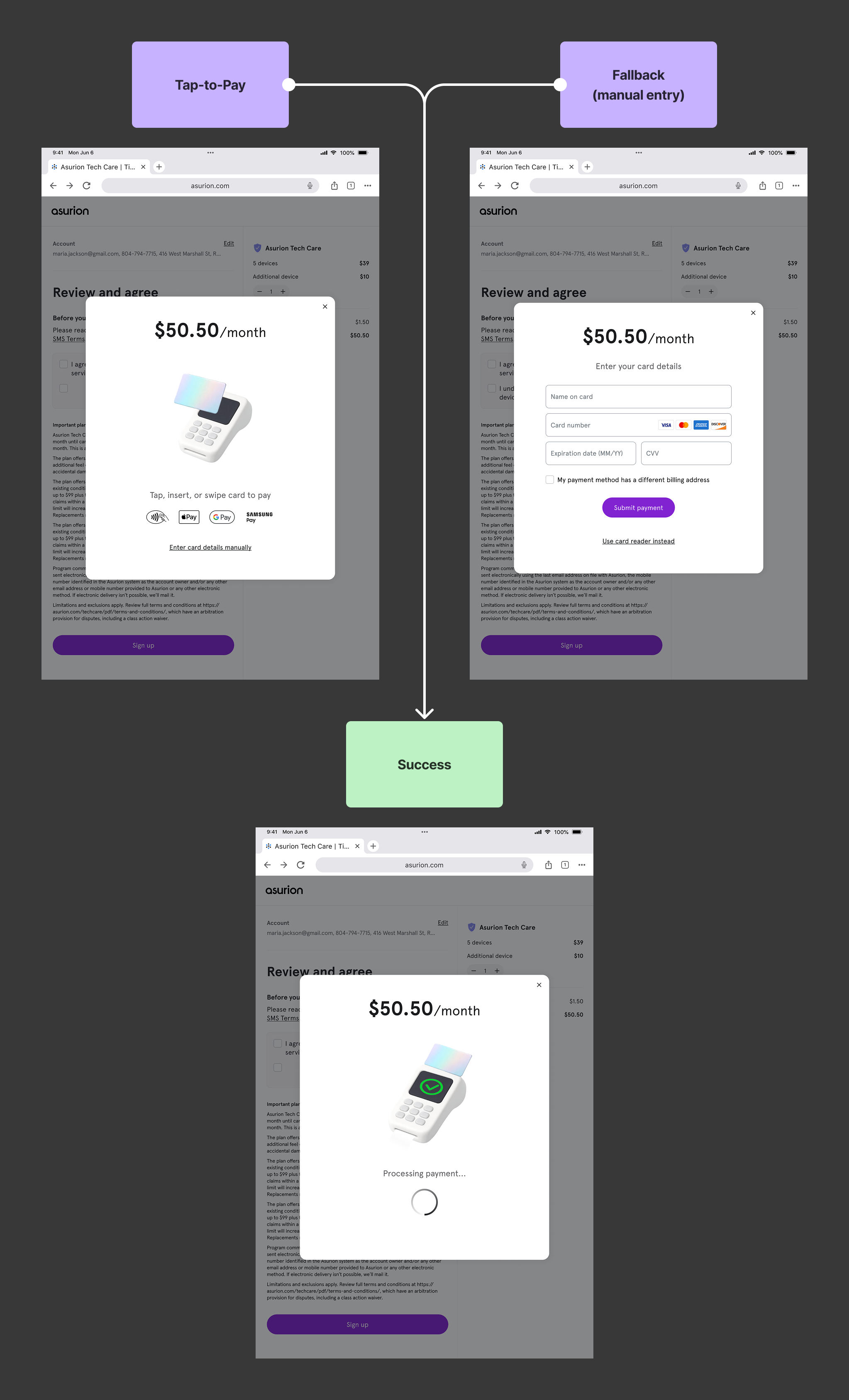
TAP-TO-PAY
A Faster Checkout Experience
I identified Tap-to-Pay as a high-impact opportunity after conducting in-store research across multiple uBreakiFix locations in Florida and Georgia. Having observed peak lunchtime and 5–7pm pickup rushes — and even “dogfooded” the experience myself during a device repair — I saw how manual credit card and billing address entry created unnecessary friction, slowed lines, and increased pressure on store reps.
Because this was a contained flow using existing POS hardware and rep tablets, I scoped it as a fast-moving experiment that could ship within a single sprint.
I partnered with our Principal Designer to align on strategy and worked closely with our in-house animation specialist to design a lightweight, intuitive tap interaction that fit within our current card reader constraints. I created early motion tests to define interaction behavior, then designed complete system states beyond the happy path, including POS downtime, card rejections, and retry flows to ensure real-world resilience.
We shipped a scrappy MVP to three corporate stores to validate usability and operational impact. Feedback from store reps was immediately positive, particularly during peak traffic windows. After a few refinements based on live usage, Tap-to-Pay rolled out nationwide.
TABLET OPTIMIZATION + ADD-ON IMPROVEMENTS
The Next Iteration
The original MVP plan for Asurion Tech Care was to launch both the in-store rep-guided flow and the direct-to-consumer web experience simultaneously, with a mobile-first approach (72% of traffic from asurion.com was mobile). Days before release, the strategy shifted: leadership chose to validate product-market fit exclusively in-store on tablets so product managers could gather real-time feedback on the ground.
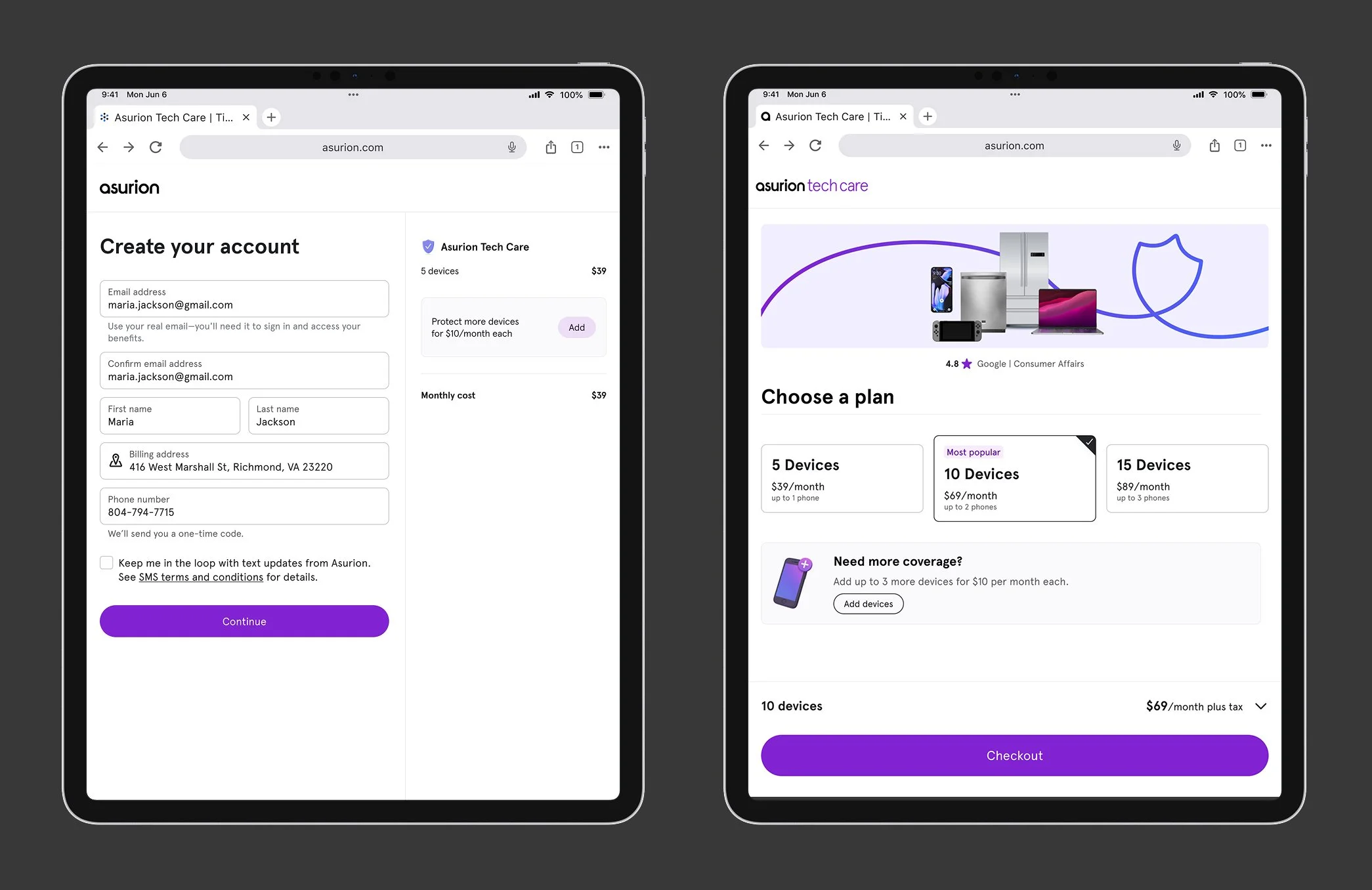
Rather than delay the launch, we moved forward with the existing experience and positioned tablet optimization as an immediate fast-follow. However, launching a tablet-first product exposed a key gap — our design system had never been operationalized for tablet as a primary experience. Breakpoints existed, but guidance around layout density, touch ergonomics, and component scaling was limited.
Within days of launch, feedback from product managers surfaced clear usability issues: touch targets were too small, the split-column layout for plan building and device add-ons felt compressed, and typography and spacing didn’t appropriately leverage the larger screen. At the same time, we saw a positive upward trend in customers adding additional devices to customize their plans — reinforcing the importance of making add-ons clearer, more discoverable, and easier to interact with.
I led the next iteration by addressing both experience-level improvements and systemic gaps. I partnered closely with the Design Systems team to define tablet-specific guidance around spacing, touch targets, and layout behavior. In parallel, I rebuilt the enrollment flow as a fully functional prototype in v0 and conducted usability testing with 18 participants to validate changes before re-release.
We closed the loop within two sprints, delivering a more ergonomic, tablet-optimized experience that supported add-on growth while strengthening our design system for future tablet-first initiatives.
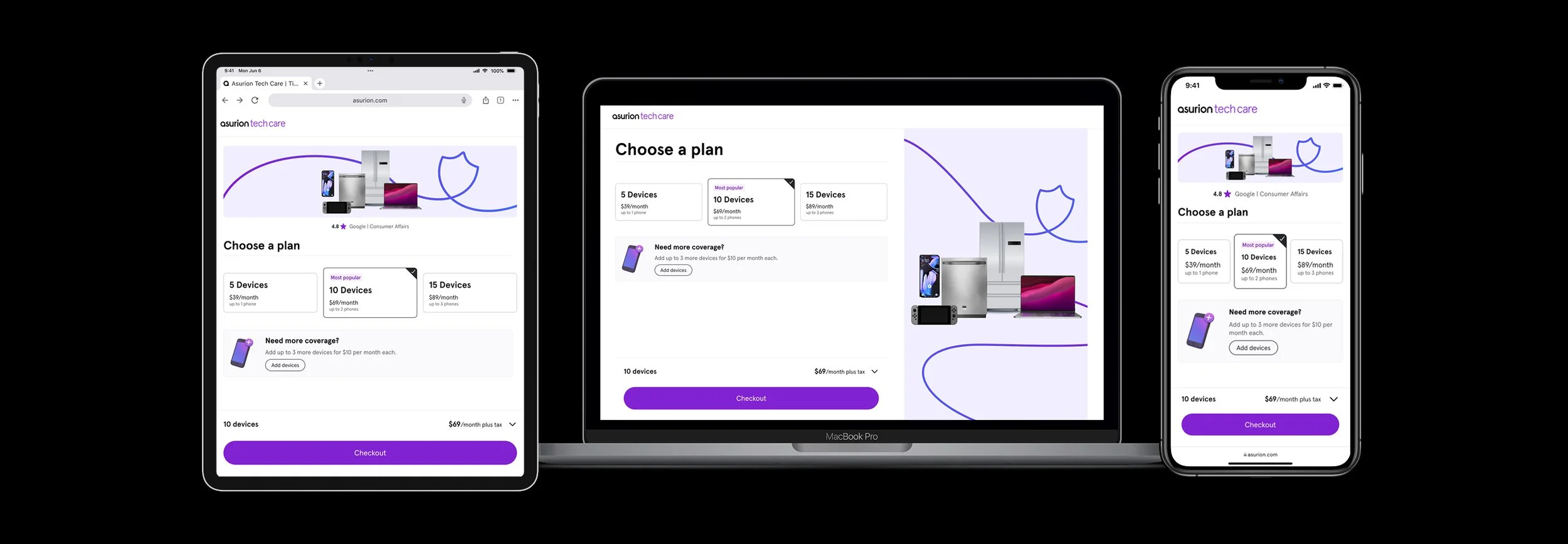
1st iteration vs.
Plan selection lived on the marketing page, and once a user chose a plan, enrollment continued as a separate micro-experience to complete setup. While this supported our initial launch strategy, it separated plan choice from add-on customization. Selecting additional devices felt more like an afterthought than part of building a personalized plan. We saw an opportunity to test whether combining these decisions would create a more cohesive and intuitive experience.
2nd iteration
We grouped plan selection and add-on customization into a single flow — and it resonated much more strongly with users. I also replaced the two-column layout with a cleaner structure that used a primary CTA and an accordion-style receipt. This surfaced the most important information (price) upfront while keeping supporting details accessible. Both changes tested significantly better and created a more intuitive customization experience.
RETROSPECTIVE
This was the first product launch I was involved in from start to finish. My key takeaways:
1. Field exposure drives clarity.
Spending time in stores made friction impossible to ignore. Observing checkout bottlenecks firsthand led directly to identifying and shipping Tap-to-Pay within a sprint.
2. Shipping exposes system gaps.
Launching tablet-first revealed weaknesses in our design system around touch targets, layout density, and scaling. Partnering with the Design Systems team allowed us to strengthen the foundation — not just patch the UI.
3. Fast iteration builds confidence.
From scrappy in-store pilots to testing a rebuilt enrollment flow with 18 users, rapid validation helped us move quickly while making informed improvements.
4. Small structural changes drive meaningful impact.
Grouping plan selection with add-ons and simplifying layout increased clarity and better supported customization behavior — improving both user confidence and business outcomes.