
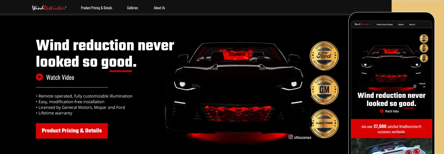
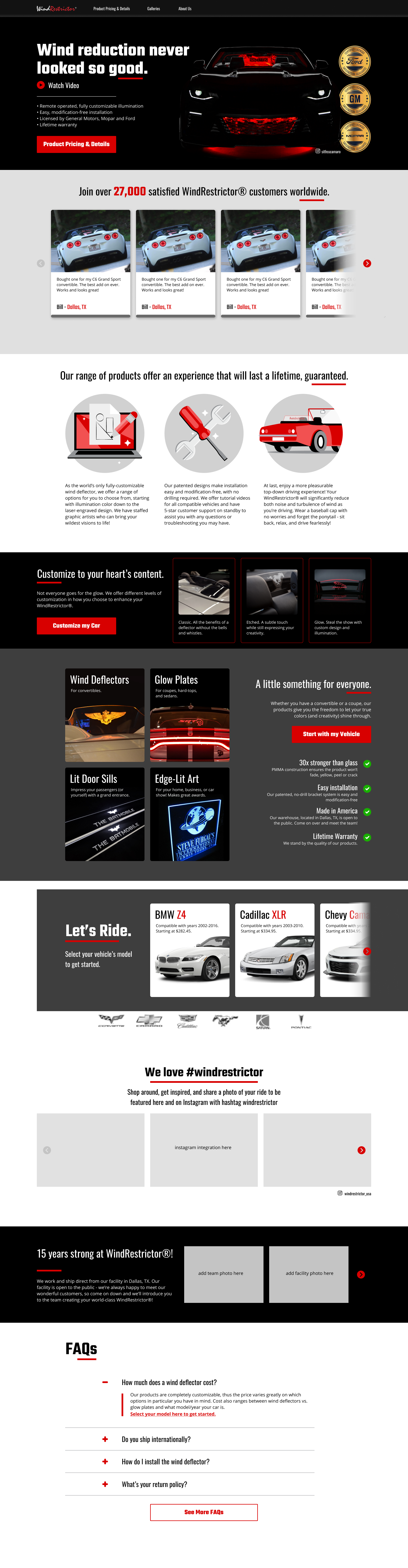
Enhance your drive, elevate your style
WindRestrictor is a licensed aftermarket accessory designed to minimize turbulence while driving a convertible with the top down.
I was brought on to optimize conversion rates and streamline the selection and purchasing experience by reducing friction throughout the process.
THE CHALLENGE
Reducing Friction in a Complex Purchase Flow
WindRestrictor is a licensed aftermarket product designed to reduce turbulence when driving a convertible with the top down. The Texas-based company was originally founded by Stephen Pennington’s brother, who began selling the windshields on eBay. After his brother’s passing, Stephen took over the business to carry on his vision and grow the brand within the car enthusiast community.
The product was high-quality, and customer service was strong—but conversion rates were under 1%. Customers struggled to navigate the site, find the right product, and feel confident completing a purchase. As a result, the company received a high volume of chat support requests from confused shoppers.
I was brought on specifically to improve conversion rate optimization (CRO) and reduce friction in the selection and purchasing process.
My role: UX/UI Designer (contractor)
CRO, Illustration, Information Architecture, Photo-editing, Storytelling, User Experience, User Flows, Visual Design
Tools: Balsamiq, Figma, Illustrator, Photoshop, Hotjar, Heap.io
Duration: 2 months
Official web store launch: May 2021

THE CORE ISSUE
Users were getting lost
Strong design follows core principles—such as emphasis, contrast, and balance—to guide users clearly toward action. On the WindRestrictor site, these principles were not working effectively. Key calls to action were buried beneath competing visuals, making it difficult for users to know where to focus.
Additionally, the product selection process violated Hick’s Law: there were too many complicated steps for users to identify the correct product for their specific vehicle. This created confusion, reduced confidence, and ultimately led to a high bounce rate, as users were unsure whether they were making the right decision.
hotjar.com
“Think of [CRO] as the process of focusing on understanding what drives, stops, and persuades your users, so you can give them the best user experience possible—and that, in turn, is what makes them convert and ultimately improves your website conversion rate.”
Because CRO was the primary driver behind this redesign, it was important for Stephen and I to align on common misconceptions surrounding traditional CRO methods. As Hotjar suggests, the more you treat users as numbers on a spreadsheet, the less you empathize with the real people behind the screen—and the further you drift from meaningful, sustainable conversion optimization.
TOOLS OF THE TRADE
Behavior analytics transforms user insights
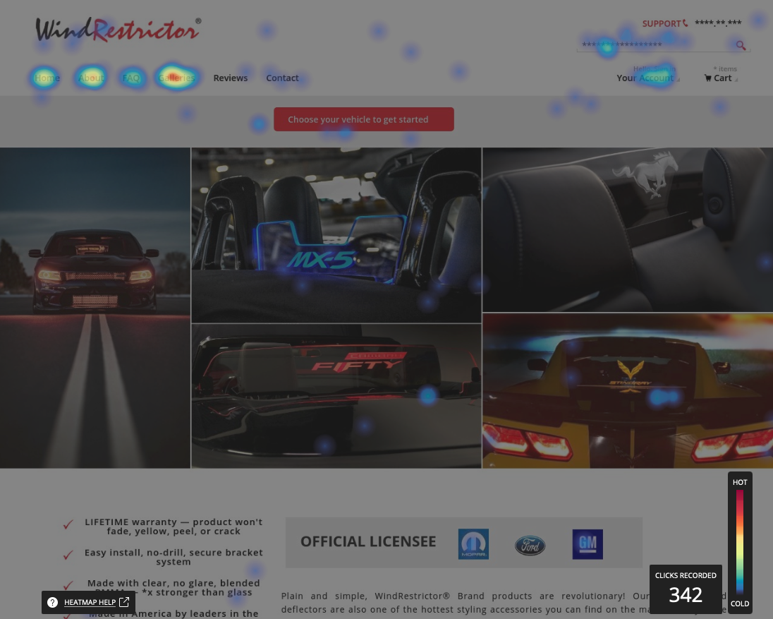
With tools like Hotjar and Heap.io, tracking user behavior and making incremental changes aligns perfectly with the build–measure–learn approach. By analyzing heatmaps and hundreds of session recordings, I was able to pinpoint drop-offs, friction points, and areas of confusion, which helped guide the redesign of the site—while keeping expectations for myself, Stephen, and the developer realistic. These insights were organized into drivers, barriers, and hooks:
Drivers: strong social media presence, Google Ads, and other advertising
Barriers: hidden calls-to-action, sticker shock, lack of user confidence (e.g., “How do I know this will fit my Dodge Charger?”)
Hooks: in-depth customization, unique product promise, looking badass at car shows or on Instagram
WIREFRAMING & PROTOTYPING
Since the majority of traffic came from social media, over 90% of first-time visitors were browsing on mobile devices. However, 86% of purchases were completed on desktop.
This made it critical to optimize the mobile experience for clarity, visual appeal, and tap-friendly interactions. Mobile served as the first touchpoint—the hook that captured interest and encouraged users to return later on desktop to explore detailed customization options and complete their purchase.
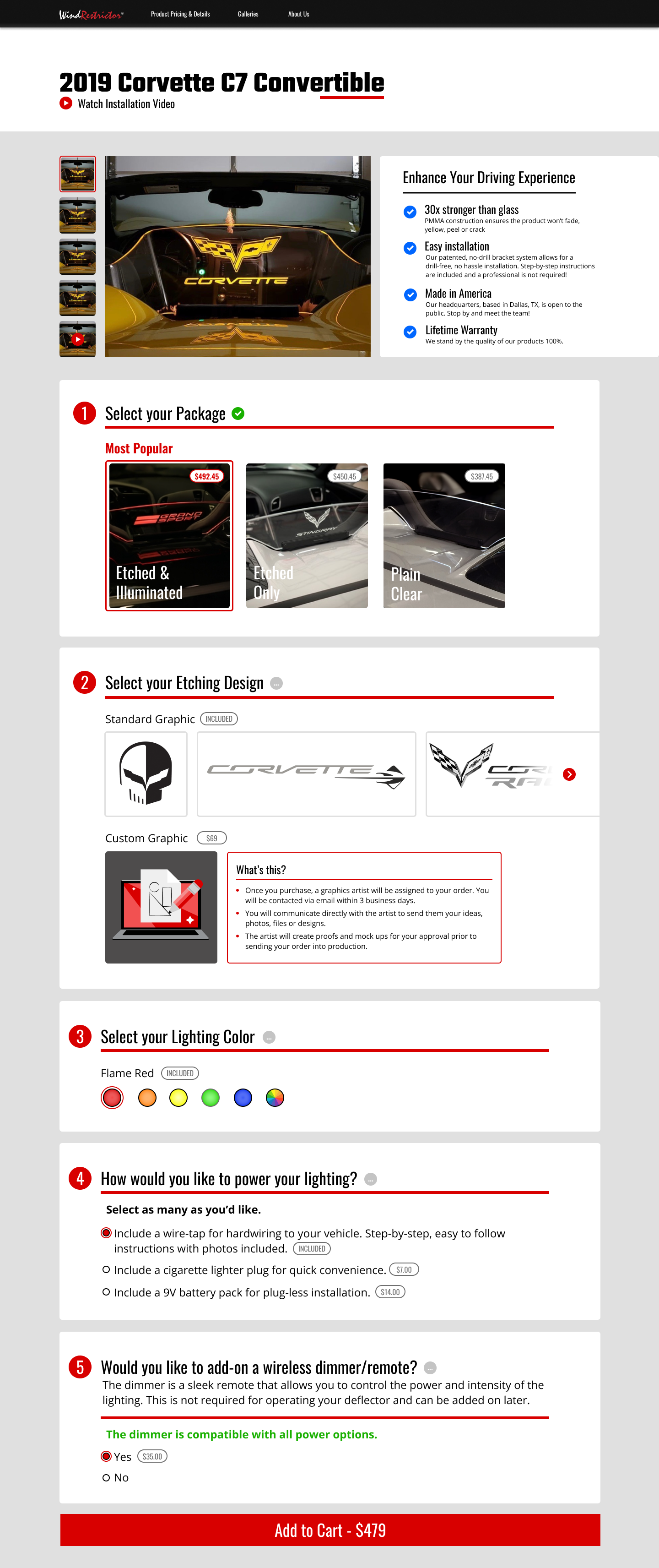
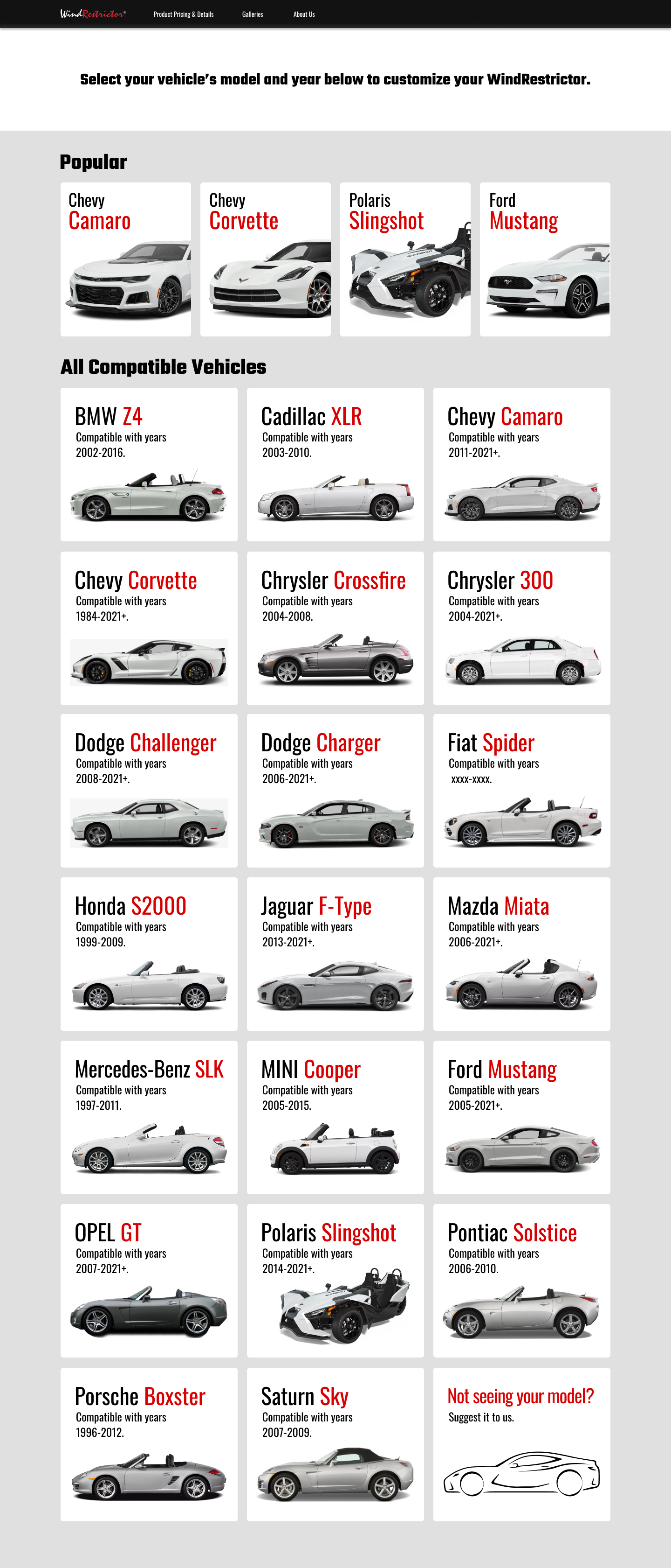
User is prompted to select their vehicle
Initial vehicle selection screen (before choosing a car).
2. User selects Mustang and chooses the body style.
3. User selects the model year range. If unavailable, they’re redirected to join a waitlist.
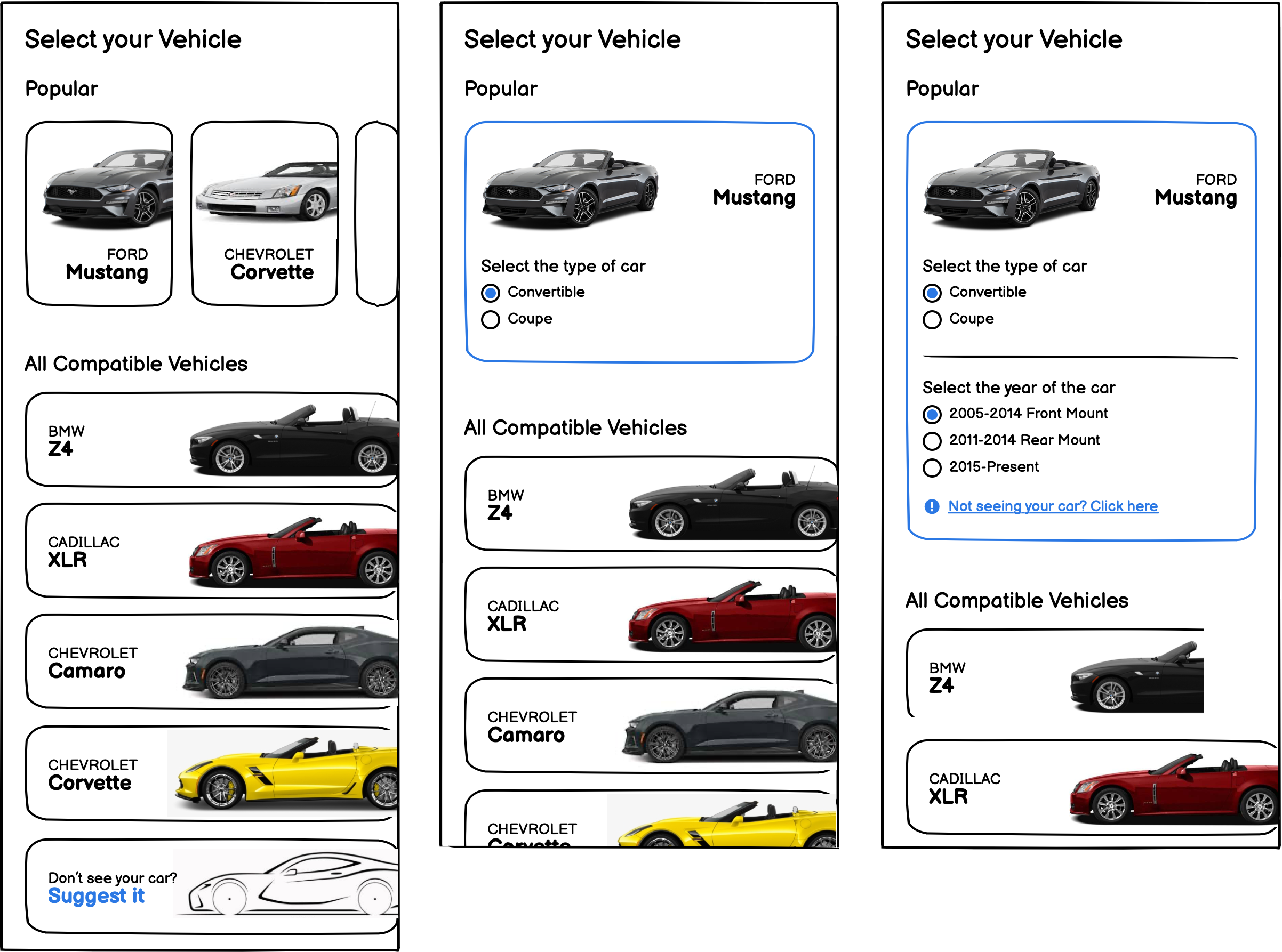
4. The waitlist captures demand for unsupported models and reduces compatibility-related chat inquiries.
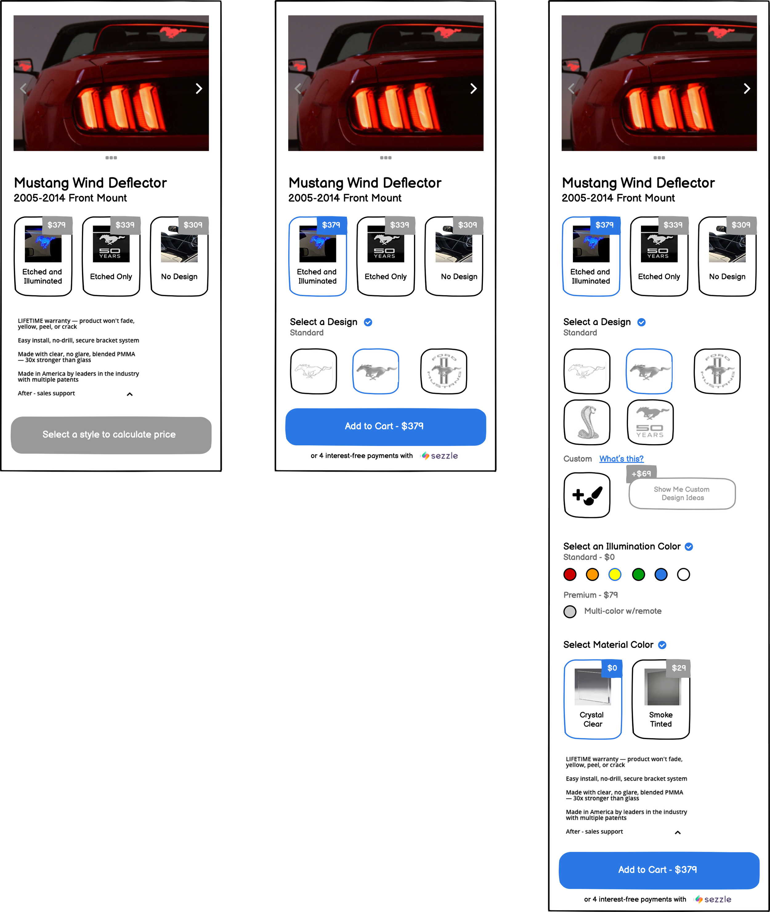
User selects Mustang and is redirected
1. Pre-style selection screen with available body style options.
2. Post-style selection screen (fixed price calculator and Add to Cart).
3. After selecting a style, scrolling, and choosing customization options.
FINAL DESIGNS
90 DAY OUTCOME
Through funnel restructuring, improved mobile-first UX, and reduced decision friction, conversion rate increased from 0.7% to 3.6% within 90 days — a 414% lift — driving over 5× more revenue from the same traffic and transforming a sub-1% funnel into a high-performing ecommerce experience.
RETROSPECTIVE
CRO and UX Are Complementary
CRO can boost conversions through testing alone, but design flaws cap potential. Treating UX and CRO as complementary ensures KPIs align with the same goals: acquisition and customer satisfaction. When UX designers and CRO experts collaborate and share insights, conversion rates aren’t just improved—they’re unlocked.